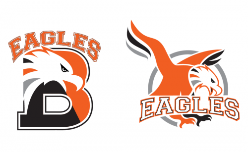
Just in time for Homecoming Weekend, the Bethlehem Central School District has unveiled a series of redesigned athletics logos that will be used by all sports teams across the district. The custom-designed athletics logos – which depict a strong, determined eagle and feature collegiate lettering — are the first in a series of updated looks and a refreshed BC brand to be introduced over the course of the 2021-22 school year.
High school students got their first look at the new athletics eagle at the Homecoming pep rally on Friday, Oct. 15.
“If ever there was a time when we could all use a fresh start, it’s now,” said Superintendent Jody Monroe. “That said, it has taken more than two years of design and discussion, revisions and refinements, with many people at the drawing board to see these plans come together. Beginning with an athletics logo that can be used by sports teams and all student groups, we see these designs as ushering in a new era for the orange-and-black, one that honors our longstanding eagle mascot.”
Other BC brand updates scheduled for the 2021-22 school year include:
- A new district logo that will reflect BC’s core values of academics, character, community and wellness (December 2021)
- Standardized icons and banners across all district social media platforms (December 2021)
- A new district website designed to be more user-friendly (Early 2022)
- Newly designed print publications for direct mail and correspondence (Early 2022)
Superintendent Monroe said the rollout of the new custom-designed logos will be gradual, with the new designs replacing the existing circular eagle silhouette as new supplies and uniforms are needed and as facilities are updated. A district branding guide will be made available that includes all of the new images (district-level and athletics), colors, and fonts and how they can be used.
“We are very excited but just getting to this point has taken years so we don’t expect an immediate changeover,” said Superintendent Monroe. “Many stakeholders have taken part in this process, beginning with three student artists who kickstarted our redesigns by bringing sketches and ideas to the table early on. Their valuable input can be seen in these designs.”
As part of an art class during the 2019-20 school year, then-sophomores Cella Labarge, Acey Puccio and Emily Spada provided early design ideas and traded feedback with district officials from the student perspective. Their work helped identify a need to have separate designs for athletics use and for district use. Other focus groups have included administrators, staff, parents, coaches, Board of Education members and students. Design notes and feedback from those groups, through a series of designs, inspired the final artwork created by the Capital Region BOCES Communications Service.
“The longstanding ‘eagle in a circle’ doesn’t lend itself to lots of different uses and over time, our teams have gotten creative with some of their own designs,” said the district’s Director of Athletics and Wellness Len Kies. “However, in doing so, we have lost some cohesiveness. These designs will bring us back to being an instantly recognizable BC brand and hopefully seen for what we are, a fierce competitor on and off the field.”
